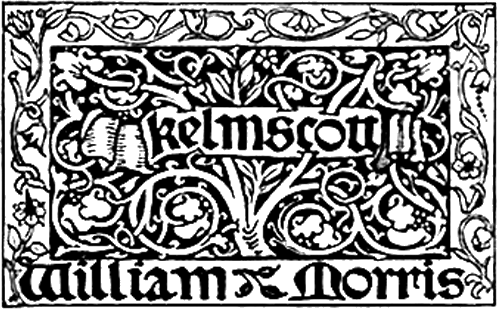
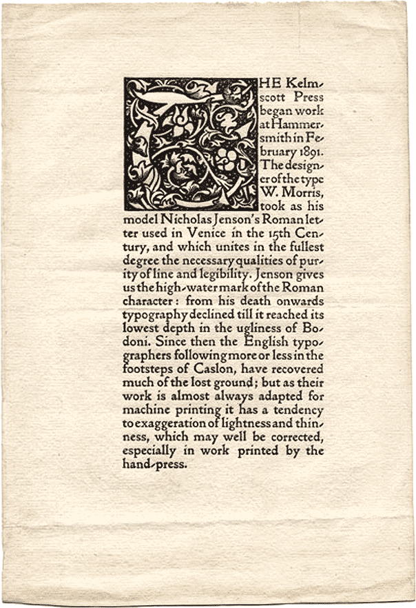
Kelmscott Press
Kelmscott Press
An Annotated List of all the Books Printed at the Kelmscott Press in the Order in which they were Issued
Note: The borders are numbered as far as possible in the order of their first appearance, those which appear on a verso or left hand page being distinguished by the addition of the letter ‘a’ to the numbers of the recto borders of similar design.
1. THE STORY OF THE GLITTERING PLAIN. WHICH HAS BEEN ALSO CALLED THE LAND OF LIVING MEN OR THE ACRE OF THE UNDYING. WRITTEN BY WILLIAM MORRIS. Small 4to. Golden type. Border 1. 200 paper copies at two guineas, and 6 on vellum. Dated April 4, issued May 8, 1891. Sold by Reeves & Turner. Bound in stiff vellum with washleather ties.
 This book was set up from Nos. 81-4 of the English Illustrated Magazine, in which it first appeared; some of the chapter headings were re-arranged, and a few small corrections were made in the text. A trial page, the first printed at the Press, was struck off on January 31, 1891, but the first sheet was not printed until about a month later. The border was designed in January of the same year, and engraved by W. H. Hooper. Mr. Morris had four of the vellum copies bound in green vellum, three of which he gave to friends. Only two copies on vellum were sold, at twelve and fifteen guineas. This was the only book with washleather ties. All the other vellum-bound books have silk ties, except Shelley’s Poems and Hand and Soul, which have no ties.
2. POEMS BY THE WAY. WRITTEN BY WILLIAM MORRIS. Small 4to. Golden type. In black and red. Border 1. 300 paper copies at two guineas, 13 on vellum at about twelve guineas. Dated Sept. 24, issued Oct. 20, 1891. Sold by Reeves & Turner. Bound in stiff vellum.
This was the first book printed at the Kelmscott Press in two colours, and the first book in which the smaller printer’s mark appeared. After The Glittering Plain was finished, at the beginning of April, no printing was done until May 11. In the meanwhile the compositors were busy setting up the early sheets of The Golden Legend. The printing of Poems by the Way, which its author first thought of calling Flores Atramenti, was not begun until July. The poems in it were written at various times. In the manuscript, Hafbur and Signy is dated February 4, 1870; Hildebrand and Hillilel, March 1, 1871; and Love’s Reward, Kelmscott, April 21, 1871. Meeting in Winter is a song from The Story of Orpheus, an unpublished poem intended for The Earthly Paradise. The last poem in the book, Goldilocks and Goldilocks, was written on May 20, 1891, for the purpose of adding to the bulk of the volume, which was then being prepared. A few of the vellum covers were stained at Merton red, yellow, indigo, and dark green, but the experiment was not successful.
3. THE LOVE-LYRICS AND SONGS OF PROTEUS BY WILFRID SCAWEN BLUNT WITH THE LOVE-SONNETS OF PROTEUS BY THE SAME AUTHOR NOW REPRINTED IN THEIR FULL TEXT WITH MANY SONNETS OMITTED FROM THE EARLIER EDITIONS. LONDON MDCCCXCII. Small 4to. Golden type. In black and red. Border 1. 300 paper copies at two guineas, none on vellum. Dated Jan. 26, issued Feb. 27, 1892. Sold by Reeves & Turner. Bound in stiff vellum.
This is the only book in which the initials are printed in red. This was done by the author’s wish.
4. THE NATURE OF GOTHIC A CHAPTER OF THE STONES OF VENICE. BY JOHN RUSKIN. With a preface by William Morris. Small 4to. Golden type. Border 1. Diagrams in text. 500 paper copies at thirty shillings, none on vellum. Dated in preface February 15, issued March 22, 1892. Published by George Allen. Bound in stiff vellum.
This chapter of the Stones of Venice, which Ruskin always considered the most important in the book, was first printed separately in 1854 as a sixpenny pamphlet. Mr. Morris paid more than one tribute to it in Hopes and Fears for Art. Of him Ruskin said in 1887, ‘Morris is beaten gold.’
5. THE DEFENCE OF GUENEVERE, AND OTHER POEMS. BY WILLIAM MORRIS. Small 4to. Golden type. In black and red. Borders 2 and 1. 300 paper copies at two guineas, ten on vellum at about twelve guineas. Dated April 2, issued May 19, 1892. Sold by Reeves & Turner. Bound in limp vellum.
This book was set up from a copy of the edition published by Reeves & Turner in 1889, the only alteration, except a few corrections, being in the 11th line of Summer Dawn. It is divided into three parts, the poems suggested by Malory’s Morte d’Arthur, the poems inspired by Froissart’s Chronicles, and poems on various subjects. The two first sections have borders, and the last has a half-border. The first sheet was printed on February 17, 1892. It was the first book bound in limp vellum, and the only one of which the title was inscribed by hand on the back.
6. A DREAM OF JOHN BALL AND A KING’S LESSON. BY WILLIAM MORRIS. Small 4to. Golden type. In black and red. Borders 3a, 4, and 2. With a woodcut designed by Sir E. Burne-Jones. 300 paper copies at thirty shillings, eleven on vellum at ten guineas. Dated May 13, issued Sept. 24, 1892. Sold by Reeves & Turner. Bound in limp vellum.
This was set up with a few alterations from a copy of Reeves & Turner’s third edition, and the printing was begun on April 4, 1892. The frontispiece was redrawn from that to the first edition, and engraved on wood by W. H. Hooper, who engraved all Sir E. Burne-Jones’ designs for the Kelmscott Press, except those for The Wood beyond the World and The Life and Death of Jason. The inscription below the figures, and the narrow border, were designed by Mr. Morris, and engraved with the picture on one block, which was afterwards used on a leaflet printed for the Ancoats Brotherhood in February, 1894.
7. THE GOLDEN LEGEND. By Jacobus de Voragine. Translated by William Caxton. Edited by F. S. Ellis. 3 vols. Large 4to. Golden type. Borders 5a, 5, 6a, and 7. Woodcut title and two woodcuts designed by Sir E. Burne-Jones. 500 paper copies at five guineas, none on vellum. Dated Sept. 12, issued Nov. 3, 1892. Published by Bernard Quaritch. Bound in half-holland, with paper labels printed in the Troy type.
In July, 1890, when only a few letters of the Golden type had been cut, Mr. Morris bought a copy of this book, printed by Wynkyn de Worde in 1527. He soon afterwards determined to print it, and on Sept. 11 entered into a formal agreement with Mr. Quaritch for its publication. It was only an unforeseen difficulty about the size of the first stock of paper that led to The Golden Legend not being the first book put in hand. It was set up from a transcript of Caxton’s first edition, lent by the Syndics of the Cambridge University Library for the purpose. A trial page was got out in March, 1891, and 50 pages were in type by May 11, the day on which the first sheet was printed. The first volume was finished, with the exception of the illustrations and the preliminary matter, in Oct., 1891. The two illustrations and the title (which was the first woodcut title designed by Mr. Morris) were not engraved until June and August, 1892, when the third volume was approaching completion. About half a dozen impressions of the illustrations were pulled on vellum. A slip asking owners of the book not to have it bound with pressure, nor to have the edges cut instead of merely trimmed, was inserted in each copy.
8. THE RECUYELL OF THE HISTORYES OF TROYE. By Raoul Lefevre. Translated by William Caxton. Edited by H. Halliday Sparling. 2 vols. Large 4to. Troy type, with table of chapters and glossary in Chaucer type. In black and red. Borders 5a, 5, and 8. Woodcut title. 300 paper copies at nine guineas, five on vellum at eighty pounds. Dated Oct. 14, issued Nov. 24, 1892. Published by Bernard Quaritch. Bound in limp vellum.
This book, begun in February, 1892, is the first book printed in Troy type, and the first in which Chaucer type appears. It is a reprint of the first book printed in English. It had long been a favourite with William Morris, who designed a great quantity of initials and ornaments for it, and wrote the following note for Mr. Quaritch’s catalogue: ‘As to the matter of the book, it makes a thoroughly amusing story, instinct with mediæval thought and manners. For though written at the end of the Middle Ages and dealing with classical mythology, it has in it no token of the coming Renaissance, but is merely mediæval. It is the last issue of that story of Troy which through the whole of the Middle Ages had such a hold on men’s imaginations; the story built up from a rumour of the Cyclic Poets, of the heroic City of Troy, defended by Priam and his gallant sons, led by Hector the Preux Chevalier, and beset by the violent and brutal Greeks, who were looked on as the necessary machinery for bringing about the undeniable tragedy of the fall of the city. Surely this is well worth reading, if only as a piece of undiluted mediævalism.’ 2000 copies of a 4to announcement, with specimen pages, were printed at the Kelmscott Press in December, 1892, for distribution by the publisher.
9. BIBLIA INNOCENTIUM: BEING THE STORY OF GOD’S CHOSEN PEOPLE BEFORE THE COMING OF OUR LORD JESUS CHRIST UPON EARTH, WRITTEN ANEW FOR CHILDREN BY J. W. MACKAIL, SOMETIME FELLOW OF BALLIOL COLLEGE, OXFORD. 8vo. Border 2. 200 on paper at a guinea, none on vellum. Dated Oct. 22, issued Dec. 9, 1892. Sold by Reeves & Turner. Bound in stiff vellum.
This was the last book issued in stiff vellum except Hand and Soul, and the last with untrimmed edges. It was the first book printed in 8vo.
10. THE HISTORY OF REYNARD THE FOXE BY WILLIAM CAXTON. Reprinted from his edition of 1481. Edited by H. Halliday Sparling. Large 4to. Troy type, with glossary in Chaucer type. In black and red. Borders 5a and 7. Woodcut title. 300 on paper at three guineas, 10 on vellum at fifteen guineas. Dated Dec. 15, 1892, issued Jan. 25, 1893. Published by Bernard Quaritch. Bound in limp vellum.
About this book, which was first announced as in the press in the list dated July, 1892, William Morris wrote the following note for Mr. Quaritch’s catalogue: ‘This translation of Caxton’s is one of the very best of his works as to style; and being translated from a kindred tongue is delightful as mere language. In its rude joviality, and simple and direct delineation of character, it is a thoroughly good representative of the famous ancient Beast Epic.’ The edges of this book, and of all subsequent books, were trimmed in accordance with the invariable practice of the early printers. Mr. Morris much preferred the trimmed edges.
11. THE POEMS OF WILLIAM SHAKESPEARE, PRINTED AFTER THE ORIGINAL COPIES OF VENUS AND ADONIS, 1593. THE RAPE OF LUCRECE, 1594. SONNETS, 1609. THE LOVER’S COMPLAINT. Edited by F. S. Ellis. 8vo. Golden type. In black and red. Borders 1 and 2. 500 paper copies at 25 shillings, 10 on vellum at ten guineas. Dated Jan. 17, issued Feb. 13, 1893. Sold by Reeves & Turner. Bound in limp vellum.
A trial page of this book was set up on Nov. 1, 1892. Though the number was large, this has become one of the rarest books issued from the Press.
12. NEWS FROM NOWHERE: OR, AN EPOCH OF REST, BEING SOME CHAPTERS FROM A UTOPIAN ROMANCE, BY WILLIAM MORRIS. 8vo. Golden type. In black and red. Borders 9a and 4, and a woodcut engraved by W. H. Hooper from a design by C. M. Gere. 300 on paper at two guineas, 10 on vellum at ten guineas. Dated Nov. 22, 1892, issued March 24, 1893. Sold by Reeves & Turner. Bound in limp vellum.
The text of this book was printed before Shakespeare’s Poems and Sonnets, but it was kept back for the frontispiece, which is a picture of the old manor-house in the village of Kelmscott by the upper Thames, from which the Press took its name. It was set up from a copy of one of Reeves & Turner’s editions, and in reading it for the press the author made a few slight corrections. It was the last except the Savonarola (No. 31) in which he used the old paragraph mark which was discarded in favour of the leaves, which had already been used in the two large 4to books printed in the Troy type.
13. THE ORDER OF CHIVALRY. Translated from the French by William Caxton and reprinted from his edition of 1484. Edited by F. S. Ellis. And L’ORDENE DE CHEVALERIE, WITH TRANSLATION BY WILLIAM MORRIS. Small 4to. Chaucer type, in black and red. Borders 9a and 4, and a woodcut designed by Sir Edward Burne-Jones. 225 on paper at thirty shillings, 10 on vellum at ten guineas. The Order of Chivalry dated Nov. 10, 1892, L’Ordene de Chevalerie dated February 24, 1893, issued April 12, 1893. Sold by Reeves & Turner. Bound in limp vellum.
This was the last book printed in small 4to. The last section is in 8vo. It was the first book printed in Chaucer type. The reprint from Caxton was finished while News from Nowhere was in the press, and before Shakespeare’s Poems and Sonnets was begun. The French poem and its translation were added as an after-thought, and have a separate colophon. Some of the three-line initials, which were designed for The Well at the World’s End, are used in the French poem, and this is their first appearance. The translation was begun on Dec. 3, 1892, and the border round the frontispiece was designed on Feb. 13, 1893.
14. THE LIFE OF THOMAS WOLSEY, CARDINAL ARCHBISHOP OF YORK, WRITTEN BY GEORGE CAVENDISH. Edited by F. S. Ellis from the author’s autograph MS. 8vo. Golden type. Border 1. 250 on paper at two guineas, 6 on vellum at ten guineas. Dated March 30, issued May 3, 1893. Sold by Reeves & Turner. Bound in limp vellum.
15. THE HISTORY OF GODEFREY OF BOLOYNE AND OF THE CONQUEST OF IHERUSALEM. Reprinted from Caxton’s edition of 1481. Edited by H. Halliday Sparling. Large 4to. Troy type, with list of chapter headings and glossary in Chaucer type. In black and red. Borders 5a and 5, and woodcut title. 300 on paper at six guineas, 6 on vellum at 20 guineas. Dated April 27, issued May 24, 1893. Published by William Morris at the Kelmscott Press. Bound in limp vellum.
This was the fifth and last of the Caxton reprints, with many new ornaments and initials, and a new printer’s mark. It was first announced as in the press in the list dated Dec., 1892. It was the first book published and sold at the Kelmscott Press. An announcement and order form, with two different specimen pages, was printed at the Press, besides a special invoice. A few copies were bound in half holland, not for sale.
16. UTOPIA, WRITTEN BY SIR THOMAS MORE. A reprint of the 2nd edition of Ralph Robinson’s translation, with a foreword by William Morris. Edited by F. S. Ellis. 8vo. Chaucer type, with the reprinted title in Troy type. In black and red. Borders 4 and 2. 300 on paper at thirty shillings, 8 on vellum at ten guineas. Dated August 4, issued September 8, 1893. Sold by Reeves & Turner. Bound in limp vellum.
This book was first announced as in the press in the list dated May 20, 1893.
17. MAUD, A MONODRAMA. BY ALFRED LORD TENNYSON. 8vo. Golden type. In black and red. Borders 10a and 10, and woodcut title. 500 on paper at two guineas, 5 on vellum not for sale. Dated Aug. 11, issued Sept. 30, 1893. Published by Macmillan & Co. Bound in limp vellum.
The borders were specially designed for this book. They were both used again in the Keats, and one of them appears in The Sundering Flood. It is the first of the 8vo books with a woodcut title.
18. GOTHIC ARCHITECTURE: A LECTURE FOR THE ARTS AND CRAFTS EXHIBITION SOCIETY, BY WILLIAM MORRIS. 16mo. Golden type. In black and red. 1500 on paper at two shillings and sixpence, 45 on vellum at ten and fifteen shillings. Bound in half holland.
This lecture was set up at Hammersmith and printed at the New Gallery during the Arts and Crafts Exhibition in October and November, 1893. The first copies were ready on October 21, and the book was twice reprinted before the Exhibition closed. It was the first book printed in 16mo. The four-line initials used in it appear here for the first time. The vellum copies were sold during the Exhibition at ten shillings, and the price was subsequently raised to fifteen shillings.
19. SIDONIA THE SORCERESS, BY WILLIAM MEINHOLD, TRANSLATED BY FRANCESCA SPERANZA LADY WILDE. Large 4to. Golden type. In black and red. Border 8. 300 paper copies at four guineas, 10 on vellum at twenty guineas. Dated Sept. 15, issued November 1, 1893. Published by William Morris. Bound in limp vellum.
Before the publication of this book a large 4to announcement and order form was issued, with a specimen page and an interesting description of the book and its author, written and signed by William Morris. Some copies were bound in half holland, not for sale.
20. BALLADS AND NARRATIVE POEMS BY DANTE GABRIEL ROSSETTI. 8vo. Golden type. In black and red. Borders 4a and 4, and woodcut title. 310 on paper at two guineas, 6 on vellum at ten guineas. Dated Oct. 14, issued in November, 1893. Published by Ellis & Elvey. Bound in limp vellum.
This book was announced as in preparation in the list of August 1, 1893.
21. THE TALE OF KING FLORUS AND THE FAIR JEHANE. Translated by William Morris from the French of the 13th century. 16mo. Chaucer type. In black and red. Borders 11a and 11, and woodcut title. 350 on paper at seven shillings and sixpence, 15 on vellum at thirty shillings. Dated Dec. 16, issued Dec. 28, 1893. Published by William Morris. Bound in half holland.
This story, like the three other translations with which it is uniform, was taken from a little volume called Nouvelles Françoises en prose du XIIIe siècle. Paris, Jannet, 1856. They were first announced as in preparation under the heading ‘French Tales’ in the list dated May 20, 1893. Eighty-five copies of King Florus were bought by J. and M. L. Tregaskis, who had them bound in all parts of the world. These are now in the Rylands Library at Manchester.
22. THE STORY OF THE GLITTERING PLAIN WHICH HAS BEEN ALSO CALLED THE LAND OF LIVING MEN OR THE ACRE OF THE UNDYING. WRITTEN BY WILLIAM MORRIS. Large 4to. Troy type, with list of chapters in Chaucer type. In black and red. Borders 12a and 12, 23 designs by Walter Crane, engraved by A. Leverett, and a woodcut title. 250 on paper at five guineas, 7 on vellum at twenty pounds. Dated Jan. 13, issued Feb. 17, 1894. Published by William Morris. Bound in limp vellum.
Neither the borders in this book nor six out of the seven frames round the illustrations appear in any other book. The seventh is used round the second picture in Love is Enough. A few copies were bound in half holland.
23. OF THE FRIENDSHIP OF AMIS AND AMILE. Done out of the ancient French by William Morris. 16mo. Chaucer type. In black and red. Borders 11a and 11, and woodcut title. 500 on paper at seven shillings and sixpence, 15 on vellum at thirty shillings. Dated March 13, issued April 4, 1894. Published by William Morris. Bound in half holland.
A poem entitled Amys and Amillion, founded on this story, was originally to have appeared in the second volume of The Earthly Paradise, but, like some other poems announced at the same time, it was not included in the book.
20a. SONNETS AND LYRICAL POEMS BY DANTE GABRIEL ROSSETTI. 8vo. Golden type. In black and red. Borders 1a and 1, and woodcut title. 310 on paper at two guineas, 6 on vellum at ten guineas. Dated Feb. 20, issued April 21, 1894. Published by Ellis & Elvey. Bound in limp vellum.
This book is uniform with No. 20, to which it forms a sequel. Both volumes were read for the press by Mr. W. M. Rossetti.
24. THE POEMS OF JOHN KEATS. Edited by F. S. Ellis. 8vo. Golden type. In black and red. Borders 10a and 10, and woodcut title. 300 on paper at thirty shillings, 7 on vellum at nine guineas. Dated March 7, issued May 8, 1894. Published by William Morris. Bound in limp vellum.
This is now (Jan., 1898) the most sought after of all the smaller Kelmscott Press books. It was announced as in preparation in the lists of May 27 and August 1, 1893, and as in the press in that of March 31, 1894, when the woodcut title still remained to be printed.
25. ATALANTA IN CALYDON: A TRAGEDY. BY ALGERNON CHARLES SWINBURNE. Large 4to. Troy type, with argument and dramatis personæ in Chaucer type; the dedication and quotation from Euripides in Greek type designed by Selwyn Image. In black and red. Borders 5a and 5, and woodcut title. 250 on paper at two guineas, 8 on vellum at twelve guineas. Dated May 4, issued July 24, 1894. Published by William Morris. Bound in limp vellum.
In the vellum copies of this book the colophon is not on the 82nd page as in the paper copies, but on the following page.
26. THE TALE OF THE EMPEROR COUSTANS AND OF OVER SEA. Done out of ancient French by William Morris. 16mo. Chaucer type. In black and red. Borders 11a and 11, both twice, and two woodcut titles. 525 on paper at seven shillings and sixpence, 20 on vellum at two guineas. Dated August 30, issued Sept. 26, 1894. Published by William Morris. Bound in half holland.
The first of these stories, which was the source of The Man born to be King, in The Earthly Paradise, was announced as in preparation in the list of March 31, 1894.
27. THE WOOD BEYOND THE WORLD. BY WILLIAM MORRIS. 8vo. Chaucer type. In black and red. Borders 13a and 13, and a frontispiece designed by Sir E. Burne-Jones, and engraved on wood by W. Spielmeyer. 350 on paper at two guineas, 8 on vellum at ten guineas. Dated May 30, issued Oct. 16, 1894. Published by William Morris. Bound in limp vellum.
The borders in this book, as well as the ten half-borders, are here used for the first time. It was first announced as in the press in the list of March 31, 1894. Another edition was published by Lawrence & Bullen in 1895.
28. THE BOOK OF WISDOM AND LIES. A book of traditional stories from Georgia in Asia. Translated by Oliver Wardrop from the original of Sulkhan-Saba Orbeliani. 8vo. Golden type. In black and red. Borders 4a and 4, and woodcut title. 250 on paper at two guineas, none on vellum. Finished Sept. 29, issued Oct. 29, 1894. Published by Bernard Quaritch. Bound in limp vellum.
The arms of Georgia, consisting of the Holy Coat, appear in the woodcut title of this book.
29. THE POETICAL WORKS OF PERCY BYSSHE SHELLEY. VOLUME I. Edited by F. S. Ellis. 8vo. Golden type. Borders 1a and 1, and woodcut title. 250 on paper at twenty-five shillings, 6 on vellum at eight guineas. Not dated, issued Nov. 29, 1894. Published by William Morris. Bound in limp vellum without ties.
Red ink is not used in this volume, though it is used in the second volume, and more sparingly in the third. Some of the half-borders designed for The Wood beyond the World reappear before the longer poems. The Shelley was first announced as in the press in the list of March 31, 1894.
30. PSALMI PENITENTIALES. An English rhymed version of the Seven Penitential Psalms. Edited by F. S. Ellis. 8vo. Chaucer type. In black and red. 300 on paper at seven shillings and sixpence, 12 on vellum at three guineas. Dated Nov. 15, issued Dec. 10, 1894. Published by William Morris. Bound in half holland.
These verses were taken from a manuscript Book of Hours written at Gloucester in the first half of the fifteenth century, but the Rev. Professor Skeat has pointed out that the scribe must have copied them from an older manuscript, as they are in the Kentish dialect of about a century earlier. The half-border on p. 34 appears for the first time in this book.
31. EPISTOLA DE CONTEMPTU MUNDI DI FRATE HIERONYMO DA FERRARA DELLORDINE DE FRATI PREDICATORI LA QUALE MANDA AD ELENA BUONACCORSI SUA MADRE, PER CONSOLARLA DELLA MORTE DEL FRATELLO, SUO ZIO. Edited by Charles Fairfax Murray from the original autograph letter. 8vo. Chaucer type. In black and red. Border 1. Woodcut on title designed by C. F. Murray and engraved by W. H. Hooper. 150 on paper, and 6 on vellum. Dated Nov. 30, ready Dec. 12, 1894. Bound in half holland.
This little book was printed for Mr. C. Fairfax Murray, the owner of the manuscript, and was not for sale in the ordinary way. The colophon is in Italian, and the printer’s mark is in red.
32. THE TALE OF BEOWULF. Done out of the Old English tongue by William Morris and A. J. Wyatt. Large 4to. Troy type, with argument, side-notes, list of persons and places, and glossary in Chaucer type. In black and red. Borders 14a and 14, and woodcut title. 300 on paper at two guineas, 8 on vellum at ten pounds. Dated Jan. 10, issued Feb. 2, 1895. Published by William Morris. Bound in limp vellum.
The borders in this book were only used once again, in the Jason. A Note to the Reader printed on a slip in the Golden type was inserted in each copy. Beowulf was first announced as in preparation in the list of May 20, 1893. The verse translation was begun by Mr. Morris, with the aid of Mr. Wyatt’s careful paraphrase of the text, on Feb. 21, 1893, and finished on April 10, 1894, but the argument was not written by Mr. Morris until Dec. 10, 1894.
33. SYR PERECYVELLE OF GALES. Overseen by F. S. Ellis, after the edition edited by J. O. Halliwell from the Thornton MS. in the Library of Lincoln Cathedral. 8vo. Chaucer type. In black and red. Borders 13a and 13, and a woodcut designed by Sir E. Burne-Jones. 350 on paper at fifteen shillings, 8 on vellum at four guineas. Dated Feb. 16, issued May 2, 1895. Published by William Morris. Bound in limp vellum.
This is the first of the series to which Sire Degrevaunt and Syr Isumbrace belong. They were all reprinted from the Camden Society’s volume of 1844, which was a favourite with Mr. Morris from his Oxford days. Syr Perecyvelle was first announced in the list of Dec. 1, 1894. The shoulder-notes were added by Mr. Morris.
34. THE LIFE AND DEATH OF JASON, A POEM. BY WILLIAM MORRIS. Large 4to. Troy type, with a few words in Chaucer type. In black and red. Borders 14a and 14, and two woodcuts designed by Sir E. Burne-Jones and engraved on wood by W. Spielmeyer. 200 on paper at five guineas, 6 on vellum at twenty guineas. Dated May 25, issued July 5, 1895. Published by William Morris. Bound in limp vellum.
This book, announced as in the press in the list of April 21, 1894, proceeded slowly, as several other books, notably the Chaucer, were being printed at the same time. The text, which had been corrected for the second edition of 1868, and for the edition of 1882, was again revised by the author. The line-fillings on the last page were cut on metal for this book, and cast like type.
29a. THE POETICAL WORKS OF PERCY BYSSHE SHELLEY. VOLUME II. Edited by F. S. Ellis. 8vo. Golden type. In black and red. 250 on paper at twenty-five shillings, 6 on vellum at eight guineas. Not dated, issued March 25, 1895. Published by William Morris. Bound in limp vellum without ties.
35. CHILD CHRISTOPHER AND GOLDILIND THE FAIR. BY WILLIAM MORRIS. 2 vols. 16mo. Chaucer type. In black and red. Borders 15a and 15, and woodcut title. 600 on paper at fifteen shillings, 12 on vellum at four guineas. Dated July 25, issued Sept. 25, 1895. Published by William Morris. Bound in half holland, with labels printed in the Golden type.
The borders designed for this book were only used once again, in Hand and Soul. The plot of the story was suggested by that of Havelok the Dane, printed by the Early English Text Society.
29b. THE POETICAL WORKS OF PERCY BYSSHE SHELLEY. VOLUME III. Edited by F. S. Ellis. 8vo. Golden type. In black and red. 250 on paper at twenty-five shillings, 6 on vellum at eight guineas. Dated August 21, issued October 28, 1895. Published by William Morris. Bound in limp vellum without ties.
36. HAND AND SOUL. BY DANTE GABRIEL ROSSETTI. Reprinted from The Germ for Messrs. Way & Williams, of Chicago. 16mo. Golden type. In black and red. Borders 15a and 15, and woodcut title. 300 paper copies and 11 vellum copies for America. 225 paper copies for sale in England at ten shillings, and 10 on vellum at thirty shillings. Dated Oct. 24, issued Dec. 12, 1895. Bound in stiff vellum without ties.
This was the only 16mo book bound in vellum. The English and American copies have a slightly different colophon. The shoulder-notes were added by Mr. Morris.
37. POEMS CHOSEN OUT OF THE WORKS OF ROBERT HERRICK. Edited by F. S. Ellis, 8vo. Golden type. In black and red. Borders 4a and 4, and woodcut title. 250 on paper at thirty shillings, 8 on vellum at eight guineas. Dated Nov. 21, 1895, issued Feb. 6, 1896. Published by William Morris. Bound in limp vellum.
This book was first announced as in preparation in the list of Dec. 1, 1894, and as in the press in that of July 1, 1895.
38. POEMS CHOSEN OUT OF THE WORKS OF SAMUEL TAYLOR COLERIDGE. Edited by F. S. Ellis. 8vo. Golden type. In black and red. Borders 13a and 13. 300 on paper at a guinea, 8 on vellum at five guineas. Dated Feb. 5, issued April 12, 1896. Published by William Morris. Bound in limp vellum.
This book contains thirteen poems. It was first announced as in preparation in the list of Dec. 1, 1894, and as in the press in that of Nov. 26, 1895. It is the last of the series to which Tennyson’s Maud, and the poems of Rossetti, Keats, Shelley, and Herrick belong.
39. THE WELL AT THE WORLD’S END. BY WILLIAM MORRIS. Large 4to. Double columns. Chaucer type. In black and red. Borders 16a, 16, 17a, 17, 18a, 18, 19a and 19, and 4 woodcuts designed by Sir E. Burne-Jones. 350 on paper at five guineas, 8 on vellum at twenty guineas. Dated March 2, issued June 4, 1896. Sold by William Morris. Bound in limp vellum.
This book, delayed for various reasons, was longer on hand than any other. It appears in no less than twelve lists, from that of Dec., 1892, to that of Nov. 26, 1895, as ‘in the press.’ Trial pages, including one in a single column, were ready as early as September, 1892, and the printing began on December 16 of that year. The edition of The Well at the World’s End published by Longmans was then being printed from the author’s manuscript at the Chiswick Press, and the Kelmscott Press edition was set up from the sheets of that edition, which, though not issued until October, 1896, was finished in 1894. The eight borders and the six different ornaments between the columns, appear here for the first time, but are used again in The Water of the Wondrous Isles, with the exception of two borders.
40. THE WORKS OF GEOFFREY CHAUCER. Edited by F. S. Ellis. Folio. Chaucer type, with headings to the longer poems in Troy type. In black and red. Borders 20a to 26, woodcut title, and 87 woodcut illustrations designed by Sir E. Burne-Jones. 425 on paper at twenty pounds, 13 on vellum at 120 guineas. Dated May 8, issued June 26, 1893. Published by William Morris. Bound in half holland.
The history of this book, which is by far the most important achievement of the Kelmscott Press, is as follows. As far back as June 11, 1891, Mr. Morris spoke of printing a Chaucer with a black-letter fount which he hoped to design. Four months later, when most of the Troy type was designed and cut, he expressed his intention to use it first on John Ball, and then on a Chaucer and perhaps a Gesta Romanorum. By January 1, 1892, the Troy type was delivered, and early in that month two trial pages, one from The Cook’s Tale and one from Sir Thopas, the latter in double columns, were got out. It then became evident that the type was too large for a Chaucer, and Mr. Morris decided to have it re-cut in the size known as pica. By the end of June he was thus in possession of the type which in the list issued in December, 1892, he named the Chaucer type. In July, 1892, another trial page, a passage from The Knight’s Tale in double columns of 58 lines, was got out, and found to be satisfactory. The idea of the Chaucer as it now exists, with illustrations by Sir Edward Burne-Jones, then took definite shape.
In a proof of the first list, dated April, 1892, there is an announcement of the book as in preparation, in black-letter, large quarto, but this was struck out, and does not appear in the list as printed in May, nor yet in the July list. In that for Dec., 1892, it is announced for the first time as to be in Chaucer type ‘with about sixty designs by E. Burne-Jones.’ The next list, dated March 9, 1893, states that it will be a folio and that it is in the press, by which was meant that a few pages were in type. In the list dated Aug. 1, 1893, the probable price is given as twenty pounds. The next four lists contain no fresh information, but on Aug. 17, 1894, nine days after the first sheet was printed, a notice was sent to the trade that there would be 325 copies at twenty pounds and about sixty woodcuts designed by Sir Edward Burne-Jones. Three months later it was decided to increase the number of illustrations to upwards of seventy, and to print another 100 copies of the book. A circular letter was sent to subscribers on Nov. 14, stating this and giving them an opportunity of cancelling their orders. Orders were not withdrawn, the extra copies were immediately taken up, and the list for Dec. 1, 1894, which is the first containing full particulars, announces that all paper copies are sold.
Mr. Morris began designing his first folio border on Feb. 1, 1893, but was dissatisfied with the design and did not finish it. Three days later he began the vine border for the first page, and finished it in about a week, together with the initial word ‘Whan,’ the two lines of heading, and the frame for the first picture, and Mr. Hooper engraved the whole of these on one block. The first picture was engraved at about the same time. A specimen of the first page (differing slightly from the same page as it appears in the book) was shown at the Arts and Crafts Exhibition in October and November, 1893, and was issued to a few leading booksellers, but it was not until August 8, 1894, that the first sheet was printed at 14, Upper Mall. On Jan. 8, 1895, another press was started at 21, Upper Mall, and from that time two presses were almost exclusively at work on the Chaucer. By Sept. 10 the last page of The Romaunt of the Rose was printed. In the middle of Feb., 1896, Mr. Morris began designing the title. It was finished on the 27th of the same month and engraved by Mr. Hooper in March. On May 8, a year and nine months after the printing of the first sheet, the book was completed. On June 2 the first two copies were delivered to Sir Edward Burne-Jones and Mr. Morris. Mr. Morris’s copy is now at Exeter College, Oxford, with other books printed at the Kelmscott Press.
Besides the eighty-seven illustrations designed by Sir Edward Burne-Jones, and engraved by W. H. Hooper, the Chaucer contains a woodcut title, fourteen large borders, eighteen different frames round the illustrations, and twenty-six large initial words designed for the book by William Morris. Many of these were engraved by C. E. Keates, and others by W. H. Hooper and W. Spielmeyer.
In Feb., 1896, a notice was issued respecting special bindings, of which Mr. Morris intended to design four. Two of these were to have been executed under Mr. Cobden-Sanderson’s direction at the Doves Bindery, and two by Messrs. J. & J. Leighton. But the only design that he was able to complete was for a full white pigskin binding, which has now been carried out at the Doves Bindery on forty-eight copies, including two on vellum.
41. THE EARTHLY PARADISE. BY WILLIAM MORRIS. VOLUME I. PROLOGUE: THE WANDERERS. MARCH: ATALANTA’S RACE. THE MAN BORN TO BE KING. Medium 4to. Golden type. In black and red. Borders 27a, 27, 28a, and 28, and woodcut title. 225 on paper at thirty shillings, 6 on vellum at seven guineas. Dated May 7, issued July 24, 1896. Published by William Morris. Bound in limp vellum.
This was the first book printed on the paper with the apple watermark. The seven other volumes followed it at intervals of a few months. None of the ten borders used in The Earthly Paradise appear in any other book. The four different half-borders round the poems to the months are also not used elsewhere. The first border was designed in June, 1895.
42. LAUDES BEATAE MARIAE VIRGINIS. Latin poems taken from a Psalter written in England about A. D. 1220. Edited by S. C. Cockerell. Large 4to. Troy type. In black, red, and blue. 250 on paper at ten shillings, 10 on vellum at two guineas. Dated July 7, issued August 7, 1896. Published by William Morris. Bound in half holland.
This was the first book printed at the Kelmscott Press in three colours. The manuscript from which the poems were taken was one of the most beautiful of the English books in Mr. Morris’s possession, both as regards writing and ornament. No author’s name is given to the poems, but after this book was issued the Rev. E. S. Dewick pointed out that they had already been printed at Tegernsee in 1579, in a 16mo volume in which they are ascribed to Stephen Langton. A note to this effect was printed in the Chaucer type in Dec. 28, 1896, and distributed to the subscribers.
41a. THE EARTHLY PARADISE. BY WILLIAM MORRIS. VOLUME II. APRIL: THE DOOM OF KING ACRISIUS. THE PROUD KING. Medium 4to. Golden type. In black and red. Borders 29a, 29, 28a, and 28. 225 on paper at thirty shillings, 6 on vellum at seven guineas. Dated June 24, issued Sept. 17, 1896. Published by William Morris. Bound in limp vellum.
43. THE FLOURE AND THE LEAFE, AND THE BOKE OF CUPIDE, GOD OF LOVE, OR THE CUCKOW AND THE NIGHTINGALE. Edited by F. S. Ellis. Medium 4to. Troy type, with note and colophon in Chaucer type. In black and red. 300 on paper at ten shillings, 10 on vellum at two guineas. Dated Aug. 21, issued Nov. 2, 1896. Published at the Kelmscott Press. Bound in half holland.
Two of the initial words from the Chaucer are used in this book, one at the beginning of each poem. These poems were formerly attributed to Chaucer, but recent scholarship has proved that The Floure and the Leafe is much later than Chaucer, and that The Cuckow and the Nightingale was written by Sir Thomas Clanvowe about A. D. 1405-10.
44. THE SHEPHEARDES CALENDER: CONTEYNING TWELVE ÆGLOGUES, PROPORTIONABLE TO THE TWELVE MONETHES. By Edmund Spenser. Edited by F. S. Ellis. Medium 4to. Golden type. In black and red. With twelve full-page illustrations by A. J. Gaskin. 225 on paper at a guinea, 6 on vellum at three guineas. Dated Oct. 14, issued Nov. 26, 1896. Published at the Kelmscott Press. Bound in half holland.
The illustrations in this book were printed from process blocks by Walker & Boutall. By an oversight the names of author, editor, and artist were omitted from the colophon.
41b. THE EARTHLY PARADISE. BY WILLIAM MORRIS. VOLUME III. MAY: THE STORY OF CUPID AND PSYCHE. THE WRITING ON THE IMAGE. JUNE: THE LOVE OF ALCESTIS. THE LADY OF THE LAND. Medium 4to. Golden type. In black and red. Borders 30a, 30, 27a, 27, 28a, 28, 29a, and 29. 225 on paper at thirty shillings, 6 on vellum at seven guineas. Dated Aug. 24, issued Dec. 5, 1896. Published at the Kelmscott Press. Bound in limp vellum.
41c. THE EARTHLY PARADISE. BY WILLIAM MORRIS. VOLUME IV. JULY: THE SON OF CRŒSUS. THE WATCHING OF THE FALCON. AUGUST: PYGMALION AND THE IMAGE. OGIER THE DANE. Medium 4to. Golden type. In black and red. Borders 31a, 31, 29a, 29, 28a, 28, 30a, and 30. Dated Nov. 25, 1896, issued Jan. 22, 1897. Published at the Kelmscott Press. Bound in limp vellum.
41d. THE EARTHLY PARADISE. BY WILLIAM MORRIS. VOLUME V. SEPTEMBER: THE DEATH OF PARIS. THE LAND EAST OF THE SUN AND WEST OF THE MOON. OCTOBER: THE STORY OF ACONTIUS AND CYDIPPE. THE MAN WHO NEVER LAUGHED AGAIN. Medium 4to. Golden type. In black and red. Borders 29a, 29, 27a, 27, 28a, 28, 31a, and 31. Finished Dec. 24, 1896, issued Mar. 9, 1897. Published at the Kelmscott Press. Bound in limp vellum.
41e. THE EARTHLY PARADISE. BY WILLIAM MORRIS. VOLUME VI. NOVEMBER: THE STORY OF RHODOPE. THE LOVERS OF GUDRUN. Medium 4to. Golden type. In black and red. Borders 27a, 27, 30a, and 30. Finished Feb. 18, issued May 11, 1897. Published at the Kelmscott Press. Bound in limp vellum.
41f. THE EARTHLY PARADISE. BY WILLIAM MORRIS. VOLUME VII. DECEMBER: THE GOLDEN APPLES. THE FOSTERING OF ASLAUG. JANUARY: BELLEROPHON AT ARGOS. THE RING GIVEN TO VENUS. Medium 4to. Golden type. In black and red. Borders 29a, 29, 31a, 31, 30a, 30, 27a, and 27. Finished March 17, issued July 29, 1897. Published at the Kelmscott Press. Bound in limp vellum.
45. THE WATER OF THE WONDROUS ISLES. BY WILLIAM MORRIS. Large 4to. Chaucer type, in double columns, with a few lines in Troy type at the end of each of the seven parts. In black and red. Borders 16a, 17a, 18a, 19, and 19a. 250 on paper at three guineas, 6 on vellum at twelve guineas. Dated April 1, issued July 29, 1897. Published at the Kelmscott Press. Bound in limp vellum.
Unlike The Well at the World’s End, with which it is mainly uniform, this book has red shoulder-notes and no illustrations. Mr. Morris began the story in verse on Feb. 4, 1895. A few days later he began it afresh in alternate prose and verse; but he was again dissatisfied, and finally began it a third time in prose alone, as it now stands. It was first announced as in the press in the list of June 1, 1896, at which date the early chapters were in type, although they were not printed until about a month later. The designs for the initial words ‘Whilom’ and ‘Empty’ were begun by William Morris shortly before his death, and were finished by R. Catterson-Smith. Another edition was published by Longmans on Oct. 1, 1897.
41g. THE EARTHLY PARADISE. BY WILLIAM MORRIS. VOLUME VIII. FEBRUARY: BELLEROPHON IN LYCIA. THE HILL OF VENUS. EPILOGUE. L’ENVOI. Medium 4to. Golden type. In black and red. Borders 28a, 28, 29a, and 29. Finished June 10, issued Sept. 27, 1897. Published at the Kelmscott Press. Bound in limp vellum.
The colophon of this final volume of The Earthly Paradise contains the following note: ‘The borders in this edition of The Earthly Paradise were designed by William Morris, except those on page 4 of volumes ii., iii., and iv., afterwards repeated, which were designed to match the opposite borders, under William Morris’s direction, by R. Catterson-Smith; who also finished the initial words ‘Whilom’ and ‘Empty’ for The Water of the Wondrous Isles. All the other letters, borders, title-pages and ornaments used at the Kelmscott Press, except the Greek type in Atalanta in Calydon, were designed by William Morris.’
46. TWO TRIAL PAGES OF THE PROJECTED EDITION OF LORD BERNERS’ TRANSLATION OF FROISSART’S CHRONICLES. Folio. Chaucer type, with heading in Troy type. In black and red. Border 32, containing the shields of France, the Empire, and England and a half-border containing those of Reginald Lord Cobham, Sir John Chandos, and Sir Walter Manny. 160 on vellum at a guinea, none on paper. Dated September, issued October 7, 1897. Published at the Kelmscott Press. Not bound.
It was the intention of Mr. Morris to make this edition of what was since his college days almost his favourite book, a worthy companion to the Chaucer. It was to have been in two volumes folio, with new cusped initials and heraldic ornament throughout. Each volume was to have had a large frontispiece designed by Sir E. Burne-Jones; the subject of the first was to have been St. George, that of the second, Fame. A trial page was set up in the Troy type soon after it came from the foundry, in Jan., 1892. Early in 1893 trial pages were set up in the Chaucer type, and in the list for March 9 of that year the book is erroneously stated to be in the press. In the three following lists it is announced as in preparation. In the list dated Dec. 1, 1893, and in the three next lists, it is again announced as in the press, and the number to be printed is given as 150. Meanwhile the printing of the Chaucer had been begun, and as it was not feasible to carry on two folios at the same time, the Froissart again comes under the heading ‘in preparation’ in the lists from Dec. 1, 1894, to June 1, 1896. In the prospectus of the Shepheardes Calender, dated Nov. 12, 1896, it is announced as abandoned. At that time about thirty-four pages were in type, but no sheet had been printed. Before the type was broken up, on Dec. 24, 1896, 32 copies of sixteen of these pages were printed and given as a memento to personal friends of the poet and printer whose death now made the completion of the book impossible. This suggested the idea of printing two pages for wider distribution. The half-border had been engraved in April, 1894, by W. Spielmeyer, but the large border only existed as a drawing. It was engraved with great skill and spirit by C. E. Keates, and the two pages were printed by Stephen Mowlem, with the help of an apprentice, in a manner worthy of the designs.
47. SIRE DEGREVAUNT. Edited by F. S. Ellis after the edition printed by J. O. Halliwell. 8vo. Chaucer type. In black and red. Borders 1a and 1, and a woodcut designed by Sir Edward Burne-Jones. 350 on paper at fifteen shillings, 8 on vellum at four guineas. Dated Mar. 14, 1896, issued Nov. 12, 1897. Published at the Kelmscott Press. Bound in half holland.
This book, subjects from which were painted by Sir Edward Burne-Jones on the walls of The Red House, Upton, Bexley Heath, many years ago, was always a favourite with Mr. Morris. The frontispiece was not printed until October, 1897, eighteen months after the text was finished.
48. SYR YSAMBRACE. Edited by F. S. Ellis after the edition printed by J. O. Halliwell from the MS. in the Library of Lincoln Cathedral, with some corrections. 8vo. Chaucer type. In black and red. Borders 4a and 4, and a woodcut designed by Sir Edward Burne-Jones. 350 on paper at twelve shillings, 8 on vellum at four guineas. Dated July 14, issued Nov. 11, 1897. Published at the Kelmscott Press. Bound in half holland.
This is the third and last of the reprints from the Camden Society’s volume of Thornton Romances. The text was all set up and partly printed by June, 1896, at which time it was intended to include ‘Sir Eglamour’ in the same volume.
49. SOME GERMAN WOODCUTS OF THE FIFTEENTH CENTURY. Being thirty-five reproductions from books that were in the library of the late William Morris. Edited, with a list of the principal woodcut books in that library, by S. C. Cockerell. Large 4to. Golden type. In red and black. 225 on paper at thirty shillings, 8 on vellum at five guineas. Dated Dec. 15, 1897, issued January 6, 1898. Published at the Kelmscott Press. Bound in half holland.
Of these thirty-five reproductions twenty-nine were all that were done of a series chosen by Mr. Morris to illustrate a catalogue of his library, and the other six were prepared by him for an article in the 4th number of Bibliographica, part of which is reprinted as an introduction to the book. The process blocks (with one exception) were made by Walker & Boutall, and are of the same size as the original cuts.
50. THE STORY OF SIGURD THE VOLSUNG AND THE FALL OF THE NIBLUNGS. BY WILLIAM MORRIS. Small folio. Chaucer type, with title and headings to the four books in Troy type. In black and red. Borders 33a and 33, and two illustrations designed by Sir Edward Burne-Jones. 160 on paper at six guineas, 6 on vellum at twenty guineas. Dated January 19, issued February 25, 1898. Published at the Kelmscott Press. Bound in limp vellum.
The two borders used in this book were almost the last that Mr. Morris designed. They were intended for an edition of The Hill of Venus, which was to have been written in prose by him and illustrated by Sir E. Burne-Jones. The foliage was suggested by the ornament in two Psalters of the last half of the thirteenth century in the library at Kelmscott House. The initial A at the beginning of the 3rd book was designed in March, 1893, for the Froissart, and does not appear elsewhere.
An edition of Sigurd the Volsung, which Mr. Morris justly considered his masterpiece, was contemplated early in the history of the Kelmscott Press. An announcement appears in a proof of the first list, dated April, 1892, but it was excluded from the list as issued in May. It did not reappear until the list of November 26, 1895, in which, the Chaucer being near its completion, Sigurd comes under the heading ‘in preparation,’ as a folio in Troy type, ‘with about twenty-five illustrations by Sir E. Burne-Jones.’ In the list of June 1, 1896, it is finally announced as ‘in the press,’ the number of illustrations is increased to forty, and other particulars are given. Four borders had then been designed for it, two of which were used on pages 470 and 471 of the Chaucer. The other two have not been used, though one of them has been engraved. Two pages only were in type, thirty-two copies of which were struck off on Jan. 11, 1897, and given to friends, with the sixteen pages of Froissart mentioned above.
51. THE SUNDERING FLOOD WRITTEN BY WILLIAM MORRIS. Overseen for the press by May Morris. 8vo. Chaucer type. In black and red. Border 10, and a map. 300 on paper at two guineas. Dated Nov. 15, 1897, issued Feb. 25, 1898. Published at the Kelmscott Press. Bound in half holland.
This was the last romance by William Morris. He began to write it on Dec. 21, 1895, and dictated the final words on Sept. 8, 1896. The map pasted into the cover was drawn by H. Cribb for Walker & Boutall, who prepared the block. In the edition that Longmans are about to issue the bands of robbers called in the Kelmscott edition Red and Black Skinners appear correctly as Red and Black Skimmers. The name was probably suggested by that of the pirates called ‘escumours of the sea’ on page 154 of Godefrey of Boloyne.
52. LOVE IS ENOUGH, OR THE FREEING OF PHARAMOND: A MORALITY. WRITTEN BY WILLIAM MORRIS. Large 4to. Troy type, with stage directions in Chaucer type. In black, red, and blue. Borders 6a and 7, and two illustrations designed by Sir Edward Burne-Jones. 300 on paper at two guineas, 8 on vellum at ten guineas. Dated Dec. 11, 1897, issued Mar. 24, 1898. Published at the Kelmscott Press. Bound in limp vellum.
This was the second book printed in three colours at the Kelmscott Press. As explained in the colophon, the final picture was not designed for this edition of Love is Enough, but for the projected edition referred to above, on page 5.
53. A NOTE BY WILLIAM MORRIS ON HIS AIMS IN FOUNDING THE KELMSCOTT PRESS, TOGETHER WITH A SHORT DESCRIPTION OF THE PRESS BY S. C. COCKERELL, AND AN ANNOTATED LIST OF THE BOOKS PRINTED THEREAT. Octavo. Golden type, with five pages in the Troy and Chaucer types. In black and red. Borders 4a and 4, and a woodcut designed by Sir E. Burne-Jones. 525 on paper at ten shillings, 12 on vellum at two guineas. Dated March 1, issued March 24, 1898. Published at the Kelmscott Press. Bound in half holland.
The frontispiece to this book was engraved by William Morris for the projected edition of The Earthly Paradise described on page 5. This block and the blocks for the three ornaments on page 7 are not included among those mentioned on page 12 as having been sent to the British Museum.
A Note by William Morris on His Aims in Founding the Kelmscott Press
 began printing books with the hope of producing some which would have a definite claim to beauty, while at the same time they should be easy to read and should not dazzle the eye, or trouble the intellect of the reader by eccentricity of form in the letters. I have always been a great admirer of the calligraphy of the Middle Ages, and of the earlier printing which took its place. As to the fifteenth-century books, I had noticed that they were always beautiful by force of the mere typography, even without the added ornament, with which many of them are so lavishly supplied. And it was the essence of my undertaking to produce books which it would be a pleasure to look upon as pieces of printing and arrangement of type. Looking at my adventure from this point of view then, I found I had to consider chiefly the following things: the paper, the form of the type, the relative spacing of the letters, the words, and the lines; and lastly the position of the printed matter on the page.
It was a matter of course that I should consider it necessary that the paper should be hand-made, both for the sake of durability and appearance. It would be a very false economy to stint in the quality of the paper as to price: so I had only to think about the kind of hand-made paper. On this head I came to two conclusions: 1st,that the paper must be wholly of linen (most hand-made papers are of cotton today), and must be quite ‘hard,’ i. e., thoroughly well sized; and 2nd, that, though it must be ‘laid’ and not ‘wove’ (i. e., made on a mould made of obvious wires), the lines caused by the wires of the mould must not be too strong, so as to give a ribbed appearance. I found that on these points I was at one with the practice of the papermakers of the fifteenth century; so I took as my model a Bolognese paper of about 1473. My friend Mr. Batchelor, of Little Chart, Kent, carried out my views very satisfactorily, and produced from the first the excellent paper which I still use.
Next as to type. By instinct rather than by conscious thinking it over, I began by getting myself a fount of Roman type. And here what I wanted was letter pure in form; severe, without needless excrescences; solid, without the thickening and thinning of the line, which is the essential fault of the ordinary modern type, and which makes it difficult to read; and not compressed laterally, as all later type has grown to be owing to commercial exigencies. There was only one source from which to take examples of this perfected Roman type, to wit, the works of the great Venetian printers of the fifteenth century, of whom Nicholas Jenson produced the completest and most Roman characters from 1470 to 1476. This type I studied with much care, getting it photographed to a big scale, and drawing it over many times before I began designing my own letter; so that though I think I mastered the essence of it, I did not copy it servilely; in fact, my Roman type, especially in the lower case, tends rather more to the Gothic than does Jenson’s.
After a while I felt that I must have a Gothic as well as a Roman fount; and herein the task I set myself was to redeem the Gothic character from the charge of unreadableness which is commonly brought against it. And I felt that this charge could not be reasonably brought against the types of the first two decades of printing: that Schoeffer at Mainz, Mentelin at Strasburg, and Gunther Zainer at Augsburg, avoided the spiky ends and undue compression which lay some of the later type open to the above charge. Only the earlier printers (naturally following therein the practice of their predecessors the scribes) were very liberal of contractions, and used an excess of ‘tied’ letters, which, by the way, are very useful to the compositor. So I entirely eschewed contractions, except for the ‘&,’ and had very few tied letters, in fact none but the absolutely necessary ones. Keeping my end steadily in view, I designed a black-letter type which I think I may claim to be as readable as a Roman one, and to say the truth I prefer it to the Roman. This type is of the size called Great Primer (the Roman type is of ‘English’ size); but later on I was driven by the necessities of the Chaucer (a double-columned book) to get a smaller Gothic type of Pica size.
The punches for all these types, I may mention, were cut for me with great intelligence and skill by Mr. E. P. Prince, and render my designs most satisfactorily.
Now as to the spacing: First, the ‘face’ of the letter should be as nearly conterminous with the ‘body’ as possible, so as to avoid undue whites between the letters. Next, the lateral spaces between the words should be (a) no more than is necessary to distinguish clearly the division into words, and (b) should be as nearly equal as possible. Modern printers, even the best, pay very little heed to these two essentials of seemly composition, and the inferior ones run riot in licentious spacing, thereby producing, inter alia, those ugly rivers of lines running about the page which are such a blemish to decent printing. Third, the whites between the lines should not be excessive; the modern practice of ‘leading’ should be used as little as possible, and never without some definite reason, such as marking some special piece of printing. The only leading I have allowed myself is in some cases a ‘thin’ lead between the lines of my Gothic pica type: in the Chaucer and the double-columned books I have used a ‘hair’ lead, and not even this in the 16mo books. Lastly, but by no means least, comes the position of the printed matter on the page. This should always leave the inner margin the narrowest, the top somewhat wider, the outside (fore-edge) wider still, and the bottom widest of all. This rule is never departed from in mediaeval books, written or printed. Modern printers systematically transgress against it; thus apparently contradicting the fact that the unit of a book is not one page, but a pair of pages. A friend, the librarian of one of our most important private libraries, tells me that after careful testing he has come to the conclusion that the mediaeval rule was to make a difference of 20 per cent. from margin to margin. Now these matters of spacing and position are of the greatest importance in the production of beautiful books; if they are properly considered they will make a book printed in quite ordinary type at least decent and pleasant to the eye. The disregard of them will spoil the effect of the best designed type.
It was only natural that I, a decorator by profession, should attempt to ornament my books suitably: about this matter, I will only say that I have always tried to keep in mind the necessity for making my decoration a part of the page of type. I may add that in designing the magnificent and inimitable woodcuts which have adorned several of my books, and will above all adorn the Chaucer which is now drawing near completion, my friend Sir Edward Burne-Jones has never lost sight of this important point, so that his work will not only give us a series of most beautiful and imaginative pictures, but form the most harmonious decoration possible to the printed book.
Kelmscott House, Upper Mall, Hammersmith. Nov. 11, 1895.
Arthur Waugh: William Morris
 orris, William (1834–1896), English poet and artist, third child and eldest son of William Morris and Emma Shelton was born at Elm House, Walthamstow, on the 24th of March 1834. His grandfather was a respected tradesman in Worcester, and his father, who was born in that town in 1797, came up to London in 1820, and entered the office of a firm of discount brokers, in which he afterwards assumed a partnership. As a child the poet was delicate but studious. He learnt to read very early, and by the time he was four years old was familiar with most of the Waverley novels. When he was six the family moved to Woodford Hall, where new opportunities for an out-ofdoor life brought the boy health and vigour. He rode about Epping Forest, sometimes in a toy suit of armour, became a close observer of animal nature, and was able to recognize any bird upon the wing. At the same time he continued to read whatever came in his way, and was particularly attracted by the stories in the Arabian Nights and by the designs in Gerard’s Herbal. He studied with his sisters’ governess until he was nine, when he was sent to a school at Walthamstow. In his thirteenth year his father died, leaving the family well-to-do; the home at Woodford was broken up, as being unnecessarily large; and in 1848 William Morris went to Marlborough, where his father had bought him a nomination. Morris was at the school three years, but got very little good from it beyond a taste for architecture, fostered by the school library, and an attraction towards the Anglo-Catholic movement. He made but slow progress in school work, and at Christmas 1851 was removed and sent to a private tutor for a year. In June 1852 he matriculated at Exeter College, Oxford, but, as the college was full, he did not go into residence till January 1853. He at once made friends, who stood him in good stead all his life, foremost among whom were Edward Burne-]ones, who was a freshman of his year, and a little Birmingham group at Pembroke. They were known among themselves as the “Brotherhood”; they read together theology, ecclesiastical history, medieval poetry, and, among moderns, Tennyson and Ruskin. They studied art, and fostered the study in the long vacations by tours among the English churches and the Continental cathedrals. Moreover, Morris began at this time to write poetry, and many of his first pieces, afterwards destroyed, were held by sound judges to be equal to anything he ever did. Both Morris and Burne-Jones had come to Oxford with the intention of taking holy orders, but as they felt their way they both came to the conclusion that there was more to be done in the direction of social reform than of ecclesiastical work, and that their energies would be best employed outside the priesthood. So Morris decided to become an architect, and for the better propagation of the views of the new brotherhood a magazine was at the same time projected, whichwas to make a speciality of social articles, besides poems and short stories.
At the beginning of 1856 the two schemes came to a head together. Morris, having passed his finals in the preceding term, was entered as a pupil at the office of George Edmund Street, the well-known architect; and on New Year’s Day the first number of The Oxford and Cambridge Magazine appeared. The expenses of this very interesting venture were borne entirely by Morris, but after the issue of No. 1 he resigned the formal editorship to his friend Fulford. Many distinguished compositions appeared in its pages, but it gradually languished, and was given up after a year’s experiment. The chief immediate result was the friendship between Morris and Dante Gabriel Rossetti, which sprang up from a successful attempt to secure Rossetti as a contributor. In the summer of 1856 Street removed to London, and Morris accompanied him, working very hard both in and out of office hours at architecture and painting. But Rossetti persuaded him that he was better suited for a painter, and after a while he devoted himself exclusively to that branch of art. It was in the summer that the two friends visited Oxford, and finding the new Union debating-hall in course of construction, offered to paint the bays. Seven artists volunteered help, and the Work was hastily begun. Morris worked with feverish energy, and on finishing the portion assigned to him proceeded to decorate the roof. The work was done too soon and too fast, the colours began to fade at once, and are now barely decipherable; but the broken designs, so long as any vestige remains, will always be interesting as a relic of an important aesthetic movement and as the first attempt on Morris’s part towards decorative art (see Rossetti). Early in 1858 Morris published The Defence of Guenevere, which was almost unnoticed by contemporary criticism, but is now recognized as one of the pearls of Victorian poetry.
On 26th April 1859 Morris married Jane Burden, a beautiful Oxford girl, who had sat to him as a model, and settled temporarily at 41 Great Ormond Street, London. Meanwhile he set about building for himself at Upton a house which was to be the embodiment of all his principles of decorative art. Furniture, decorations, household utensils and every article of daily use were specially designed, and in the summer of 1860 the house was ready for occupation. The furnishing of it had suggested a fresh activity; Morris now determined to embark upon decoration as a career. A small company was formed, consisting of D. G. Rossetti, Philip Webb, Burne-Jones, Madox Brown, Faulkner and Marshall, and in January 1862 started business under the title of Morris, Marshall, Faulkner & Co., with offices at 8 Red Lion Square. The prospectus set forth that the firm would undertake church decoration, carving, stained glass, metal-work, paper-hangings, chintzes and carpets. The business, after inevitable vicissitudes, nourished, but the “house beautiful” at Upton proved to be unhealthily situated. Serious illness obliged the family to remove to town, and in November 1865 they resettled at 26 Queen Square, Bloomsbury. Morris was now unceasingly busy, but he found time also for literature. In June 1867 he published The Life and Death of Jason, which was at once successful; and in April 1868 the first two parts of The Earthly Paradise. The rest of this wonderful storehouse of poetic romance appeared in two volumes in 1869 and 1870. In the following year he was again looking for a country house, and lighted upon Kelmscott manor house, in the Upper Thames valley, which he took at first in joint-tenancy with Rossetti and used principally as a holiday home. In 1872 appeared Love is Enough, structurally the most elaborate of his poems for its combination of the epic and dramatic spirits; and in the autumn he began to translate the shorter Icelandic sagas, to which his enthusiasm had been directed by two inspiring journeys to Iceland. Business worries, however, interrupted him; it was found necessary to reconstruct the company owing to its having grown out of proportion with the existing division of profit and labour. Long negotiations ensued, and in March 1875 the old firm was dissolved. Morris now became sole manager and proprietor, although the other members of the old firm continued, in varying degrees, to give him the advantage of their assistance and advice.
Meanwhile the epic mood had possessed Morris very strongly, and, in addition to his work upon the sagas, he had actually finished and (in 1875) published a verse translation of the Aeneid, which is interesting rather for its individuality than for any fidelity to the spirit of the original. In the following year appeared Sigurd the Volsung, a version full of heroic vigour, movement and vitality, but somewhat too lengthy and incoherent in design to preserve the epic interest intact to the British taste. This splendid burst of poetic activity, however, had raised him to a place among the first poets of his time; and in 1877 an attempt was made to induce him to accept the professorship of poetry at Oxford. But he felt himself lacking in the academic spirit, and wisely declined. At this time a fresh outlet for his energy was furnished by his foundation in 1877 of the Society for the Protection of Ancient Buildings, which sprang into being as a practical protest against a scheme for restoring and reviving Tewkesbury Abbey. He began, too, to take an active interest in politics over the Eastern Question, but his enthusiasm was at the moment a flash in the pan. Finding that events were going against his judgment, Morris, as was so often the case with him, shrugged his shoulders and broke free from the movement.
Still, although he found it hard to sit close to a definite party, Morris continued to be spasmodically interested in political movements. During the next few years, indeed, the interest gained ground with him steadily. He became treasurer of the National Liberal League in 1879, but after the Irish coercive measures of 1881 he finally abandoned the Liberal party, and drifted further and further into Socialism. For ten or twelve years this movement had been gaining ground in England, and the Social Democratic Federation was formed in 1881. In January 1883, within a week of his election to an honorary fellowship at Exeter, Morris was enrolled among its members. Thenceforward for two years his advocacy of the cause of Socialism absorbed not only his spare time, but the thought and energy of all his working hours. For it he even neglected literature and art. In March 1883 he gave an address at Manchester on “Art, Wealth and Riches”; in May he was elected upon the executive of the federation. In September he wrote the first of his Chants for Socialists. About the same time he shocked the authorities by pleading in University Hall for the wholesale support of Socialism among the undergraduates at Oxford. Nevertheless, the federation began to weaken. At the franchise meeting in Hyde Park in 1884 it was unable to get a hearing. Morris, however, had not yet lost heart. Internal dissensions in 1884 led to the foundation of the Socialist League, and in February 1885 a new organ, Commonweal, began to print Morris’s splendid rallying-songs. Still, differences of opinion and degree prevented concerted action; and when, after the Trafalgar Square riots in February 1886, Morris remonstrated with the anarchic section he was denounced by the advanced party and ever afterwards was regarded with suspicion. In 1889 he was deposed from the management of Commonweal, and gradually lost all confidence in the movement as an active force.
Long before that time, however, Morris had returned to the paramount interests of his life—to art and literature. When his business was enlarged in 1881 by the establishment of a tapestry industry at Merton, in Surrey, Morris found yet another means for expressing the medievalism that inspired all his work, whether on paper or at the loom. In 1887 he published his translation of the Odyssey, which had many of the qualities and defects of his Aeneid, and is much more interesting as an experiment than valuable as a “Homeric echo.” In the Commonweal appeared News from Nowhere, published in book form in 1891, describing an England in which the principles of communism have been realized. He then added another to his many activities; he assumed a direct interest in typography. In the early seventies he had devoted much attention to the arts of illumination and calligraphy. He himself wrote several manuscripts, with illuminations of his own devising. From this to attempts to beautify the art of modern printing was but a short step. The House of the Wolfings, printed in 1889 at the Chiswick Press, was the first essay in this direction; and in the same year, in The Roots of the Mountains, he carried his theory a step further. Some fifteen months later he added a private printing-press to his multifarious occupations, and started upon the first volume issued from the Kelmscott Press, his own Glittering Plain. For the last few years of his life this new interest remained the absorbing one. A series of exquisite books, which gain in value every year, witnesses to the thorough and whole-hearted fashion in which he invariably threw himself into the exigencies of his life-work.
The last years of his life were peacefully occupied. He was sounded as to whether he would accept the laureateship upon the death of Tennyson, but declined, feeling that his tastes and his record were too remote from the requirements of a court appointment. His last piece of work, the crowning glory of his printing-press, was the Kelmscott Chaucer, which had taken nearly two years to print, and fully five to plan and mature. It was finished in June 1896, and before it was in his hands he already knew that his working day was over. His vigour had been slowly declining for some time, and he sank gradually during the autumn, dying on the 3rd of October 1896. He was buried in Kelmscott churchyard, followed to the grave by the workmen whom he had inspired, the members of the league which he had supported, the students of the art gild he had founded, and the villagers who had learnt to love him.
Essentially the child of the Gothic revival, he had put an ineffaceable stamp on Victorian ornament and design, his place being that of a follower of Ruskin and Pugin, but with a greater practical influence than either. In house decoration of all kinds—furniture, wall-papers and hangings (which he preferred to paper), carpet-weaving, and the painting of glass and tiles, needlework, tapestry—he formed a school which was dominated by his protest against commercialism and his assertion of the necessity for natural decoration and pure colour, produced by hand work and inspired by a passion for beauty irrespective of cheapness or quickness of manufacture (see Arts and Crafts). The truest criticism of William Morris is that attributed to his friend, the poet Swinburne, who said that he was always more truly inspired by literature than by life. His Socialism, though it made a brave show at times, was at heart a passionate enthusiasm for an inaccessible artistic ideal. Morris, indeed, was not primarily interested in men at all, but in objects. His poetry deals, it is true, with the human passions, but the emotion is always seen as in a picture; he is more concerned with the attitude of the group than with the realization of a character. He had very little adaptability in dealing with his fellows; the crowd, as a crowd, fired his enthusiasm, but he was unable to cope with the individuals that composed it. Many of his colleagues bear witness to his generosity and magnanimity, but as a general principle he certainly lacked the wider humanity. This is the one failing of his art: it is also the shortcoming of his poetry. Granted this, there is left an immense amount that will always command admiration. The spirit of beauty breathes in every line; a sense of music and of colour is everywhere abundant; the reader moves, as it were, under a canopy of apple-blossom, over a flower-starred turf, to the faint harmony of virginals. Nor does the poet lack power and vigour when an adventurous story is to be told. The clash of arms breaks upon his pagan paradise with no uncertain sound; he is swift in narrative, breathless in escapade. And over all hangs the faint atmosphere of medievalism, of an England of green gardens and grey towers, of a London “small and white and clean," of chivalry and adventure in every brake. The critic has also to remember the historical value of Morris’s literary influence, following upon the prim domesticities of early Victorian verse, and breaking in upon Tennyson’s least happy phase of natural homeliness.
See the Life and Letters, in 2 vols. (Longmans), by J. W. Mackail. An article on “William Morris and his Decorative Art,” by Lewis F. Day, appeared in the Contemporary Review for June 1903.
— Encyclopædia Britannica, Eleventh Edition, Cambridge: University Press, 1911. Vol. XVIII, pp. 871-873.